№.10 Site of Departure, Part Three
The Design and Implementation of affale.fr.
In case you missed last week’s announcement, AFFALÉ launched its first collection!
This week, I’ve published several posts on the behind-the-scenes details of launching the collection. I covered the backstory of the different products that make up the collection earlier last week, and last Friday I delved into my product photography philosophy and its results.
Today, we’re wrapping up the series with a look at the design and implementation of AFFALÉ’s site, affale.fr—including few of its more interesting nooks and crannies that make a bit different than your average direct-to-consumer e-commerce experience, as well as some parting thoughts on the whole thing!
VI. The Design And Implementation Of
I wish I could say I had been faithful to the original vision for AFFALÉ’s... online shop? Digital storefront? E-commerce experience? I loathe these kinds of neologisms, and the ghastly chimeras they describe. Start referring to your car as “my wheeled horse,” and duct-tape some horsehair onto the tailgate, why don’t you. As Marshall McLuhan would say...
"A new medium is never an addition to an old one, nor does it leave the old one in peace. It never ceases to oppress the older media until it finds new shapes and positions for them."
You’d be hard-pressed to prove that our the new medium, the Internet—dynamic media, delivered instantaneously, globally—has thus far added anything of value to the concept of a physical “store.” And, most e-commerce sites don’t even so far as to even attempt to mimic the physical experience of retail shopping, opting instead to mindlessly ape the catalog formats of yestercentury, but with far less warmth and verve than their predecessors to boot.
Whether the experience is meditated VR, AR, or just plain old R, pixels ‘n bits have yet to come into their own as a medium, one that can rival brick ‘n mortar in terms of pure experience. I so wanted AFFALÉ’s humble www. to be different. After all, I’m a user experience designer at heart. I’ve even wrote my thesis on pioneering new digital formats and interactions!
Today, an “e-commerce experience” is usually nothing more than a database containing products, exposed to the customer by implementing a very thin layer of UX on top. Forget the sense of serendipitous discovery, forget the relational warmth of sales associates—you’re lucky if you get paltry affordances like “filter: by color” and “price: low to high.” You might as well ask your customers to learn SQL!
There’s so much more power and rich interactivity that’s possible with the web. I have countless sketches along the lines of the vision I hinted at in the text messages above. Alas, reality also has a say in such matters, and it said, quietly but firmly: Save your human-computer interaction research for when you’re profitable. Touché. Shopify templates it is! Slouching towards Bethlehem, one compromise at a time...
VII. Logotypes
After finishing all of the product photography, I recalled a crucial bit of self-knowledge: I hate post-processing more than I hate doing the dishes.
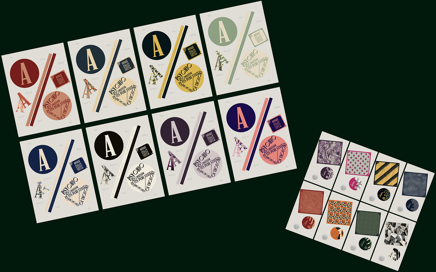
So I procrastinated by doodling little logotypes for all the product categories, not seriously intending to use them. They were more like character studies, meant to serve as eigenvectors for my felt-sense of the body of product I was putting out into the world. I often feel compelled to method-act like this—as you may recall, I spoofed an entire edition of a century-old newspaper as part of the initial AFFALE branding.
But hours stretched into days, and, soon enough, I had amassed quite the stable of cute little visual identities…
I promptly scraped the work I’d done on the site thus far, and rearchitected it around the physicality of these logotypes. As pretty as my product photography was, I simply loathe the full-bleed laziness adopted by almost all e-commerce sites these days, whose designers appear to be driven by a pathological need to divorce form from content. I was reminded of Christopher Alexander’s prescription in A Pattern Language regarding windows:
“In our current ways of building, the delicacy of placing a window or a door has nearly vanished. But it is just this refinement, down to the last foot, even to the last inch or two, which makes an immense difference. Windows and doors which are just right are always like this. Find a beautiful window. Study it. See how different it would be if its dimensions varied a few inches in either direction.
“Now look at the windows and doors in most buildings made during the last 20 years. Assume that these openings are in roughly the right place, but notice how they could be improved if they were free to shift around, a few inches here and there, each one taking advantage of its own special circumstances - the space immediately inside and the view outside…
“…Fine tune the exact position of each edge, and mullion, and sill, according to your comfort in the room, and the view that the window looks onto. As a result, each window will have a different size and shape, according to its position in the building.”
To hell with content-as-water! To hell with rectangle vision! I was determined to do things the old-fashioned way: to bespoke-sculpt form and content together, into something that feels like it crackles with life-energy.
The green-gray-pink color scheme was only ever intended to be a placeholder for a bolder, to-be-decided primary, secondary, and accent scheme. I hit upon plenty of beautiful combinations, ones that really made the different logotypes sing...
Unfortunately, given the color maximalism of AFFALÉ’s products, none of these jived with the vibrancy of my product photos. Color overwhelm is real! There has to be a sense of balance, a certain set of proportions, in order to create a certain glow in a painting or an interface. To quote Christopher Alexander once more:
“All we know is that sometimes colors together create a glow of life. The colors, like centers, help one another come to life; a life which is created and can be felt. It is ineffable, but we can feel it, certainly, empirically, and move towards it…
“…It is clear that color complementaries play a huge role. But, often, in the really profound cases, light is created in an asymmetrical way; for instance, a large amount of pale yellow with a small mount of deeper blue, or a large amount of pale clear reds offset by deeper and intense turquoise. And of course, if one color is paler or weaker than another, there must be more of it, so that the total “amount” of the two colors is actually equal…
“…because, arithmetically, they must sum to “light.”
Elsewhere in the graphics department, I created templates for cute lil’ design explainers, to round out the duffel and scarf product pages.
At this point, the product pages were pretty much finished! I dashed off some of the fine print—rather important in my case, given both that my garments are made-to-order, and that I’m offering customers the option to submit a Midjoruney prompt and receive a custom garment printed with an artwork generated from said prompt—and sent a preview version of the site off to my ever-faithful editors: my parents.
Their one comment—beyond the usual quibbles regarding font sizes1 — was that the bottom edge of the product page proper needed a “definite ending,” as visually, it was bleeding rather chaotically into the sustainability infographic I had placed in the footer of the product pages.
Wanting something more, let’s say, grand, than a hairline-thin divider, I fired up my beloved Midjourney, and iterated through various architectural sketches of baroqueish moldings until I found one I liked.

Turn-of-the-century-French-surrealist-painter’s-country-estate vibe, indeed!
VIII. Atelier and Bulletin!
Above and beyond the duffels, the scarves, the pattern swatches, and the calligrammes, AFFALÉ is exploring a couture concept, named, simply, Atelier. Or, going by the logotype, Big-A-Atelier. If you haven’t noticed yet, we’re big on A-play, ‘round these parts.

The client-courtier relationship, of course, is the ticket, the thing that makes creating custom pieces so magical, and so rewarding. Both rare and rarefied, even before fast fashion’s eclipse, it’s a delicate pleasure of mine to be able to create a space where both the wearer and the designer can relate to a handful of garments in a manner that’s so high-touch, and at not-so-out-of-reach-as-one-might-expect-for-this-sort-of-thing price points —$5,000 for three unique pieces, (for now, enjoy it while it lasts!).
And given the incredibly high dimensionality of the creative-technological space AFFALÉ occupies—3D-printed trims and accessories, stable-diffusion-generated artworks, custom fit and sizing, various patternmaking wonders, and new reconfigurations of what it means to possess a garment—I’ve also found the grounding presence of the energy of a specific individual, rather than some more abstract entity, such as the market, to be a lovely instrument of way-finding, of meaning-making.
Here’s the full blurb I wrote for the Atelier section of the site:
Beloved imagination, what I most like in you is your unsparing quality.
Inspire a fantasy all your own by engaging Atelier, a new couture concept from AFFALÉ. Imagine unboxing an entire capsule collection informed by your unique essence, that only you own, your own idiosyncratic wardrobe within which to envelop yourself as you make your way through the world.
With the additional options for the full tailoring experience, custom pieces jewelry designed in conversation with the artwork and silhouettes of the garments, and a mirrored digital ONE.Experience for each garment made, AFFALÉ's Atelier is the most beautiful, most advanced fashion experience available.
If the idea of having a few special pieces, or even an entire mini-wardrobe, made custom for you sounds appealing to you, you should drop us a line! We’re open to a wide variety of arrangements. Click here to apply now, or learn more about what all the concept entails here. Or, have a friend who might be a good fit for the concept? Share Atelier with them!
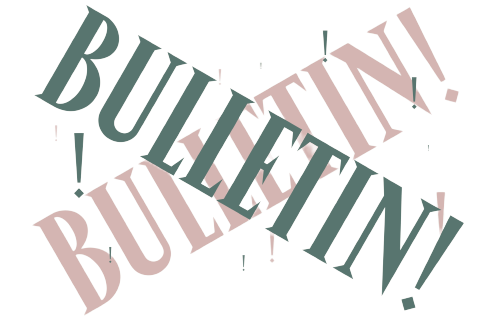
And, as to Bulletin!?2
Bulletin! is, well, the evolution of this very blog! Given I started writing many months earlier in the process, I’m not quite sure if I’ve articulated the full vision I have for this whole brand-blog enterprise yet. But I took a stab at it for it’s re-launch on AFFALÉ’s own site:
So last century! So next century!
The Industrial Revolution started with fashion. The next technological revolution will start with fashion, too.
Fashion allows us to imagine worlds far removed from our own, yet it always remains grounded in the present. As technology advances, it reshapes this balance, introducing new tools, materials, and visions that redefine the edge of our dreams. And just as the looms and machinery of the past heralded an era of unprecedented change, so will the integration of modern tech with our wardrobe herald the down of a new epoch of human flourishing.
AFFALÉ is first and foremost a vehicle both for exploring and advancing the interplay of fashions eye and technology's force, and Bulletin! is a written record of these efforts.
The kind of Bric-a-brac, I-Spy vibe I hit upon with the title card designs delighted me, and eventually I’ll find a way to imbue the whole Shopify incarnation of the blog with this aesthetic.
I would sooner move my online shop to Substack than move my newsletter to Shopify, but for the time being I don’t see why straddling both isn’t an option!
Coda
One brand, two weeks, three photo shoots, four products, five Figma files, six logotypes, and seven—I don’t have anything with the quantity of seven to include here, but it seemed devilishly wrong to break off the numerical aliteration at six—seven somethings ‘a-something, and there we have it: affale.fr is live and alive!
Oh, and about those gowns I mentioned, in the first part of this series… they finally arrived!
But! They’ll have to wait their turn. They deserve their own moment.
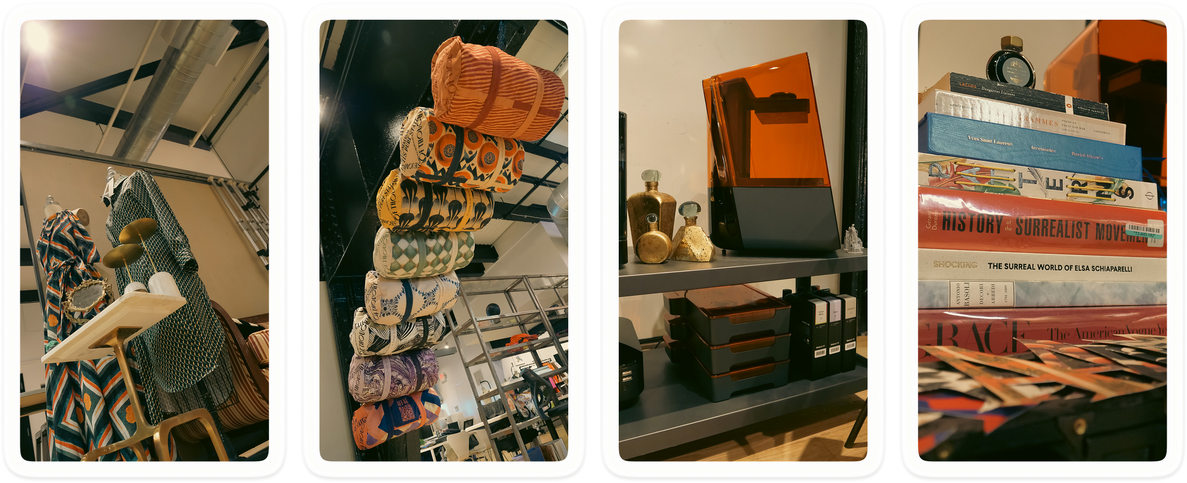
And the duffels, the scarves, the pattern swatches, and calligrammes deserve theirs. AFFALÉ’s debut collection, Manifeste du surréalisme, is now live! Go check it out, and maybe even buy something—a few of your fellow readers already have!
plus chic, tu meurs,
—jane
Hofstadter's Law of Typography: The font sizes I choose are always too small, even when I know and account for the fact that the font sizes I choose are always too small!
Unintentional interrobang! Incorporating a punctuation mark into one’s logotypes, as I’ve done with Bulletin!, does expose one to little frictions such as these. But it can also be a delicious asset, as in the case of Jony Ive’s LoveFrom,:
“Ultimately, Saville’s suggestion was deceptively simple: Add a comma at the end of LoveFrom. He notes that the comma offered an intangible counterbalance to the word love. ‘It gave [the name] some sincerity,’ he says. Commas are also rare in logotype, so it was surprising. LoveFrom wanted a relationship with the audience, and it implied a dialogue. The logo is, quite literally, frozen in a perpetual state of being about to say more.
“‘[We] thought that the comma was a beautiful device, one that really speaks to not a statement but asking a question,’ Ive says. ‘And it’s about the beginning.’”
LoveFrom,’s comma communicates a sort of latent generativity, the violent shimmers arcing across the smooth surface of a pregnant pause the instant before one’s discursive impulse shatters it to pieces. I want Bulletin!’s italics-and-exclamation-mark logotype to evoke something similarly poignant, a memory you may or may not personally have, of you scurrying your way up out of the Paris Metro and catching a glimpse of a poster, glued there by some or other student group, in support of some or other totalizing cause, and emblazoned with a hedonistic masthead, ‘Title!,’ whose exuberance catches you entirely off-guard. You’re swept up in your memories of a time when you, too, lived life according to a self-fulfilling naiveté such as theirs.


